Color theory is a framework that has guided artists, designers, and creators for centuries. It attempts to explain how colors interact, the emotional responses they evoke, and how they can be harmonized or contrasted in visual compositions. Yet, there are instances where the principles of color theory seem to falter or even clash with real-world applications. This exploration examines the limitations of color theory, when its rules break down, and how those moments can lead to innovative practices in design and art.
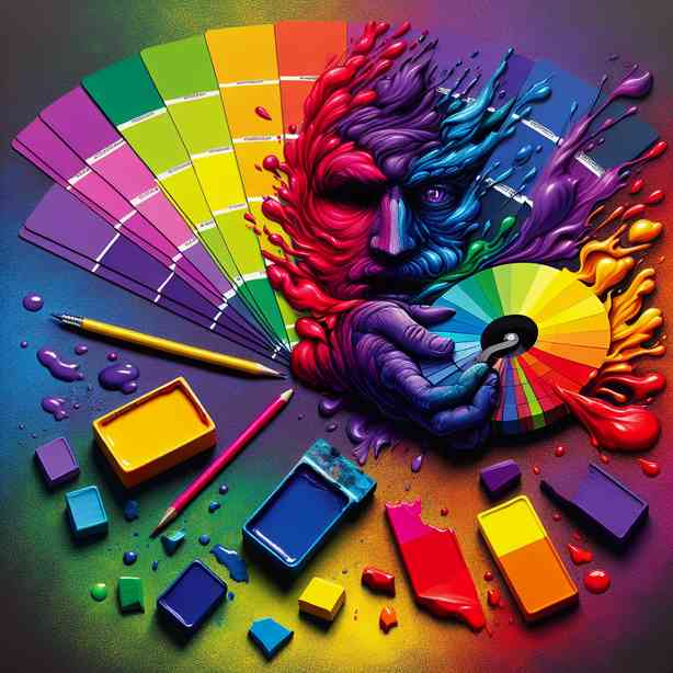
At the heart of color theory are concepts like the color wheel, primary, secondary, and tertiary colors, as well as the relationships between complimentary, analogous, and triadic colors. These concepts form the backbone of many artistic and design processes, providing tools to create balance and beauty. However, there are occasions when strict adherence to these rules may hinder creativity or fail to resonate with particular audiences. One common scenario arises in cultures with distinctive color symbolism. For instance, while red may symbolize passion or love in Western contexts, it can represent danger or even mourning in other cultures. Therefore, designers who rely solely on traditional color theory may risk alienating their audience if they neglect these cultural nuances.
Furthermore, color perception can vary dramatically from person to person due to factors such as lighting, medium, and individual differences in color vision. For example, a painting may appear vibrant and warm in natural light, but take on a muted or cold appearance under artificial lighting. Artists often find themselves grappling with these variations, which can lead to frustrations when their work does not align with theoretical expectations. This discrepancy can reveal the limitations of color theory as a universal guide, highlighting the importance of context and environment when working with colors.
One particularly fascinating divergence from strict color theory is the phenomenon known as simultaneous contrast. This occurs when two colors placed side by side influence one another’s perception. For example, a gray square on a white background may appear more vibrant than if it were placed on a darker surface. This effect can challenge classical color theory, which emphasizes the relative value and saturation of colors in isolation. Artists like Victor Vasarely and other Op Art creators have exploited these contrasts to create dynamic, visually stimulating works that defy traditional expectations and inspire new ways of seeing.
Then there is the concept of color emotionality. While color theory suggests predictable emotional responses—blue evokes calm and serenity while yellow can promote happiness—these reactions can vary widely among individuals. A critical aspect of color emotionality is not only the color itself but also the surrounding colors and elements in a composition. This nuance can muddy the waters of color theory, as the same hue might elicit different feelings based on its context. Designers and artists must navigate these complexities, acknowledging that their intentions may not always align with the viewer’s interpretations and associations.
Interestingly, the advent of technology presents another challenge to traditional color theory. Digital mediums, for example, utilize RGB (red, green, blue) color systems, differing starkly from the CMYK (cyan, magenta, yellow, key/black) system used in print. This technological shift can lead to practical inconsistencies that challenge the theoretical foundations laid out by color theorists. Artists and designers may find themselves in a space where the colors they see on-screen do not translate accurately to printed materials, prompting them to adjust their processes and rethink their color strategies. This interaction between technology and artistry underscores the need for flexibility, encouraging creatives to step outside the rigid boundaries of established norms.
In terms of modern branding and marketing, colors are strategically employed to evoke specific feelings and associations, yet there are instances where the application defies color theory. For example, choice brands may employ unexpected color combinations to create a sense of intrigue or challenge preconceived notions. Think of luxury brands that utilize black, gold, or even neon colors in ways that evoke sophistication despite color theory’s typical guidelines. These brands understand that breaking the “rules” can sometimes lead to stronger emotional connections and a distinct brand identity.
The role of trends also cannot be ignored. Trends often lead to the temporary abandonment of color theory principles. The rise of minimalist design, for example, emphasizes the use of a limited color palette or even monochrome schemes that contrast with the vibrant color relationships discussed in traditional color theory. These trends invite a reinterpretation of how color theory can be applied or omitted depending on the desired effect, reflecting cultural shifts and collective aesthetic preferences.
Furthermore, chaos and spontaneity have a rightful place in color application, illustrated by the works of abstract expressionists like Jackson Pollock. Here, intuitive color choices and emotional expressions take precedence over the deliberate application of color theory. The resulting works challenge viewers to ponder emotional depth and individual perception rather than conforming to predefined expectations based on color relationships. In this way, color theory’s limitations reveal opportunities for exploration and expression in ways that transcend structural confines.
Similarly, the evolving nature of color perception is significant to this discourse. As society progresses, so do the meanings and associations attached to colors. Factors such as cultural changes, political climates, and social movements shift how colors are viewed and used creatively. The color pink, once primarily associated with femininity, has taken on new connotations in the context of gender identity and activism. Traditional color theory often fails to account for such evolution, illustrating the challenge of applying static rules to a dynamic world.
Color accessibility is another critical consideration in contemporary design. For individuals with color blindness or other visual impairments, what is traditionally considered a harmonious color palette may not function effectively. This serves as a reminder that color theory must be adapted to promote inclusivity, prompting designers to consider contrasts in brightness and texture rather than relying solely on color relationships. By breaking theorized rules and addressing accessibility, designers can broaden their reach and evoke emotions across diverse audiences.
Thus, it becomes apparent that while color theory provides a valuable framework for understanding color relationships and applications, it is essential to recognize its limitations. When the established rules are challenged, they can lead to unexpected discoveries and innovative practices in the worlds of art and design. By embracing the moments when color theory breaks down, artists and designers can explore new realms of expression and meaning, creating work that resonates on deeper levels and reflects the complexity of human perception.
In conclusion, although color theory equips artists and designers with foundational knowledge and guidance in their practice, it is clear that the rigidity of these rules can sometimes be counterproductive. The interplay between cultural contexts, personal perceptions, technological advancements, and emotional responses highlights the fluidity of color and its meanings. Adapting and evolving one’s understanding of color in light of these considerations can pave the way for creativity that challenges traditional boundaries, fostering a richer and more inclusive approach to color in art and design. Ultimately, by acknowledging the moments when color theory may not apply or even falters, creators can liberate themselves from constraints and explore the uncharted territories of color expression freely.