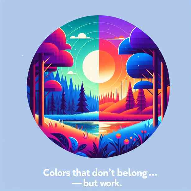
When it comes to color theory and design, one might think that every hue has its designated place, each carefully selected to reflect harmony and balance. However, some colors that may seem out of place can surprisingly work beautifully together, creating visually striking combinations that capture attention and evoke emotion. This phenomenon can intrigue designers and artists alike as they explore the boundaries of traditional color schemes and challenge conventional norms. In this exploration, we will dive into the colors that typically don’t belong together but end up creating stunning visual effects.
To begin, understanding color theory is essential. The color wheel is a tool designers frequently use to determine color relationships. Complementary colors sit directly opposite each other on the wheel, like blue and orange or red and green. These combinations create contrast and vibrancy, making them classic choices in design. Analogous colors, which are next to each other on the wheel, tend to evoke a sense of harmony, as they share a similar emotional weight. However, when we introduce colors that normally don’t belong together, we can access a power that transcends traditional color pairing.
One striking example of unexpected color combinations can be seen in bright yellow and deep purple. On first glance, these two colors appear to clash – yellow radiates energy and warmth, while purple conveys sophistication and mystery. However, when applied strategically in design, these colors can create a dynamic tension that draws the eye and creates a memorable scene. Imagine a modern living room where a deep purple accent wall is paired with vibrant yellow throw pillows. The room instantly comes alive, despite the bold contrast; It showcases how harnessing opposing colors can create balance because they complement rather than compete with each other.
Another notable pairing is the combination of teal and burnt orange. Teal, a serene and cool color, evokes feelings of tranquility, while burnt orange reflects warmth, vitality, and earthiness. Together, they create a striking visual contrast that can be seen in nature, such as in sunsets where these colors intermingle. Designers often utilize this combination in branding due to its ability to evoke emotion and encourage audience engagement. In a retail space, this palette can inject energy into the ambiance, making the environment more inviting.
Exploring color combinations that defy conventions also brings us to the relationship between pink and green. Traditionally, these colors are often paired with softer shades to create a whimsical and inviting look. However, when combined in their more intense shades – fuchsia with emerald green, for example – the effect is bold and eye-catching. This combo tends to challenge the norms of femininity and masculinity, introducing an empowering feel to design. Brands that embrace such pairs often stand out because they dare to redefine expectations, effectively capturing attention through color.
In addition to these examples, contrasting colors like navy blue and mustard yellow offer yet another avenue for exploration. Navy blue provides stability and calmness, while mustard yellow injects a dose of cheerfulness and vigor. When combined, they create a balanced, sophisticated palette that can be used in a variety of contexts, from professional branding to casual fashion. This combination often evokes feelings of comfort and security with an exciting twist, capturing the balance between tradition and modernity.
Incorporating unexpected colors into spaces can breathe new life into designs, creating memorable experiences. The use of colors that seem mismatched often invites creativity and uniqueness in settings, which is particularly beneficial in areas such as interior design, branding, and fashion. For instance, pairing strawberry red with soft lavender in a room can produce an electrifying energy that keeps the atmosphere light and fresh. This example illustrates that the application of colors that do not obviously belong next to each other can yield unmatched results when executed with intention and creativity.
As we navigate through the spectrum of color relationships, it becomes clear that breaking the rules can lead to innovative solutions and unexpected beauty. This bravery in design encourages creators to experiment beyond their comfort zones. Artists who embrace these bold color choices often find that they unlock new forms of expression and mark their creations with a distinctive signature style.
From an artistic standpoint, layering colors that do not traditionally align is a technique used to create depth and interest. For example, if an artist employs shocking pink juxtaposed with rich emerald in their artwork, the result may produce layers of meaning and evoke emotional responses that standard palettes simply can’t achieve. This layering invites viewers to engage more deeply, exploring the narrative that unfolds with rich tones and unexpected contrasts.
Despite the intuitive notion that certain colors simply “don’t go together,” the beauty of discovery arises when daring to experiment. The design world flourishes when individuals take risks with their color choices, leading to endless possibilities. Especially in a rapidly evolving culture where visual stimuli are omnipresent, finding a unique aesthetic can set one apart from the crowd. Hence, exploring offbeat color combinations becomes more than a creative exercise; it becomes a critical aspect of defining modern identity.
In conclusion, colors that don’t belong together, when appropriately combined, can yield some of the most compelling and visually dynamic results across various design fields. Whether one is decorating a living space, creating compelling fashion statements, or conceptualizing branding, embracing the unexpected can lead to exciting outcomes. The practice of combining improbable colors not only transforms aesthetics but also reflects the complexities of our experiences and emotions, making it a vital consideration in the evolving world of design. As we continue exploring the endless possibilities of color, let us always remain open to designs that challenge our perceptions and inspire our creativity.